LAUNCHED DESIGN
Shaping Wellness Foundation
Designing an end-to-end website for a new local nonprofit supporting girls' health & confidence.
OVERVIEW
I’m excited to share that this project officially launched in August 2025! As the sole designer, I worked closely with the developer to bring the vision to life and ensure the design was implemented as closely 1:1 as possible. The website is now live at shapingwellness.org. This case study is still in progress and will soon include the mobile prototype and final updates.
DURATION
12 weeks
TOOLS
Figma
Adobe Illustrator
Google Meets
TEAM
Product Designer
1 Developer
1 Stakeholder

ABOUT SHAPING WELLNESS FOUNDATION
The Shaping Wellness Foundation is a Houston-based nonprofit focused on fostering the health, well-being, and empowerment of young girls in underserved communities. As the foundation prepared for its public debut, I was brought on as the sole Product Designer to create its first website: a platform that would introduce the organization, build credibility, attract donors, and inform the community about upcoming programs and events.
THE CHALLENGE
As a brand-new nonprofit with no existing website, branding, or digital content, Shaping Wellness Foundation needed a functional and compelling online presence that reflected its mission, built trust with visitors, and made it easy for users to engage, whether through donations, volunteering, or participation in programs.
Main problems:
Lack of brand identity and digital presence
No established information architecture
No way to build credibility or collect donations
Need to accommodate future growth and program updates

THE SOLUTION
I designed a welcoming, mission-driven website that bridges offline impact with online engagement. The design prioritizes trust, accessibility, and storytelling to help the foundation connect with its audience and grow its reach.
Lack of trust and visibility
Clear homepage messaging, founder story, and pilot program descriptions
Low user engagement
Prioritized scrollable homepage with mission highlights, multiple CTAs, and interest forms
No brand identity
Custom logo, warm color palette, modern type, and consistent branding throughout
No donation infrastructure
Dedicated donation page with secure payment options and projected impact transparency
STREAMLINED SIGN-UP PROCESS
Clear flows with multiple call-to-action buttons and an organized information architecture so users never feel lost. The site was designed to minimize friction and make it easy for users to take action, whether that’s donating, volunteering, or learning more.
RESPONSIVE & ACCESSIBLE DESIGN
I prioritized mobile optimization after identifying mobile usability as a key issue. Layouts and interactions were tested across devices, and accessibility best practices (high contrast and readable fonts) were applied to ensure an inclusive experience.
BUILDING TRUST & CREDIBILITY
To build trust, I emphasized clear program details, transparent messaging, and strong calls-to-action. Content was rewritten and pages restructured to reflect an organized, forward-thinking foundation prepared for growth.

WEBSITE TOUR
Want a quick look at the final design? Watch this short video for a full preview of the Shaping Wellness Foundation website before it launches!
THE PROCESS
I led the end-to-end design process, starting with user research to understand how people engage with nonprofits online. I then created the site architecture, wireframes, and visual design system - iterating on feedback to ensure clarity and trust. I’m now collaborating closely with a developer to bring the vision to life and prep for launch.
MEETING MY USERS
I interviewed 6 participants who had experience supporting or exploring nonprofit organizations. I asked questions about how they find and evaluate nonprofits, what makes a website trustworthy, and what actions they typically take (donate, sign up for events, volunteer, etc.).
Key Insights:
Users judge credibility based on clarity, transparency, and ease of navigation.
Emotional storytelling increases engagement.
Sign-up processes must be frictionless and secure.
Users want to know where their contributions are going and how they’re making an impact.

DISCOVERING MARKET PATTERNS & GAPS
I analyzed the websites of similar nonprofits, such as Girls Inc., Girls Who Code, and Black Girls Smile, to understand best practices in content, structure, and user flow.
Findings:
Clear mission statement and visual branding up front
Donate/Get Involved CTA’s were consistently primary nav elements
Emotional imagery paired with real community stories built trust and connection
While many nonprofit websites provide information about their mission and programs, many struggle to engage users, with clunky design, unclear messaging, and frustrating user flows that drive visitors away before they can connect or contribute.
SO WHAT?
HOW MIGHT WE help users effortlessly discover, understand, and engage with Shaping Wellness Foundation through an experience that feels intuitive and trustworthy?
FOCUSING ON THE USERS
User interviews influenced the creation of empathy maps for three personas that would be interacting with the nonprofit: the volunteer, the donor, and the partner. I was able to uncover patterns and priorities across user types, allowing me to tailor the design to better support their goals and enhance their overall experience.


MAPPING THE JOURNEY
To better understand and design for the nonprofit's audience, I created a consolidated user journey diagram that highlights the shared experience across all three personas. Rather than isolating each persona’s journey, I chose to take a comprehensive approach that acknowledges how the nonprofit would be interacting with volunteers, donors, and partners simultaneously.
By focusing on the overall experience rather than a single touchpoint, I ensured that the design would support all user types.

NARROWING DOWN THE SCOPE
One of the key challenges was aligning the stakeholder's broad vision with the need for a focused and timely launch. Through a strategy meeting, we collaborated to define a clear MVP, prioritizing essential features while outlining a roadmap for future growth. This ensured the initial site met immediate organizational needs while supporting long-term goals.


SKETCHES & WIREFRAMES
Once I had an idea of what the site structure was, I began the design process by sketching key screens to explore layout ideas and ensure the content hierarchy aligned with user priorities. I then tested them with the stakeholder for clarity and alignment with the nonprofit's tone and goals.
These sketches evolved into low-fidelity wireframes that focused on structure, usability, and clarity. The wireframes helped visualize the MVP layout and allowed for early feedback before moving into high-fidelity design.

INTRODUCING COLOR
BRANDING & DESIGN SYSTEM
Since no branding existed, I created a visual identity system from scratch. I used moodboards, typography, and color palettes to define a look that felt uplifting, bold, trustworthy, and youth-focused.
Final Branding Choices:
Color palette: Warm, energetic colors centered around coral and orange tones
Typography: Rounded sans-serif for warmth and clarity
Logo design: A minimal symbol that conveys growth and movement

REFINING THE EXPERIENCE
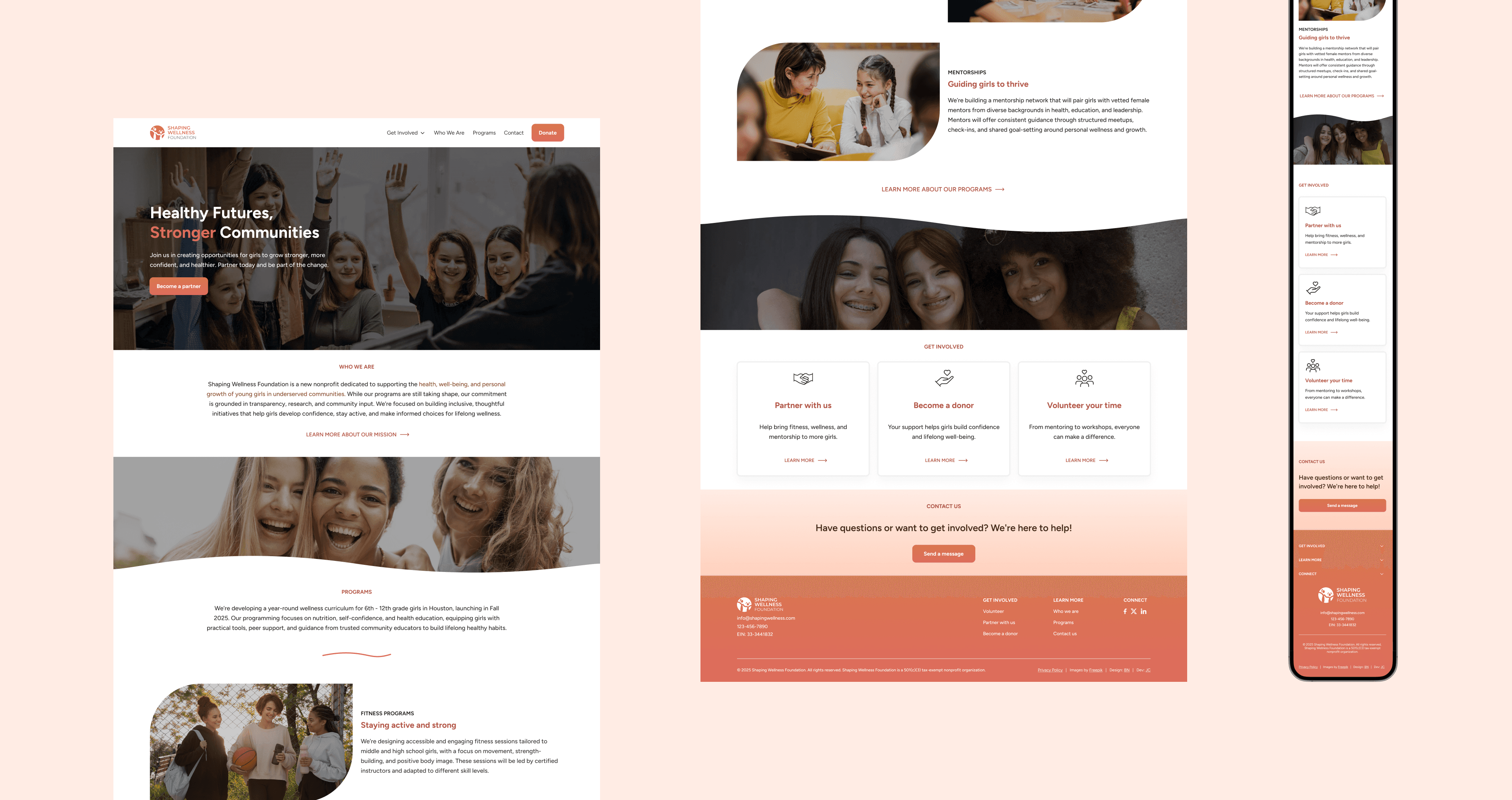
After finalizing the branding and wireframes, I moved into high-fidelity design to bring the site to life with the newly established visual identity. I focused on creating clean, accessible layouts that highlighted the nonprofit’s mission and guided users through key actions like learning about the organization, learning about specific programs, or getting involved.


MIMICKING REAL-LIFE INTERACTIONS
I built an interactive prototype to test the user flow and gather feedback on the overall usability and visual hierarchy. This step was essential in validating design decisions before developing and ensuring the experience felt intuitive and engaging for first-time visitors.
USABILITY TESTING
Once I had the first draft of high fidelity designs, I ran a moderated usability testing with 8 users unfamiliar with the organization.
Tasks included:
Exploring the site
Making a donation
Signing up to volunteer
Overall, testing results were positive. However, two key issues emerged that revealed opportunities for immediate improvement. These insights led directly to two priority revisions that further refined the experience.

PRIORITY REVISION 1: TRUST WAS STILL LACKING
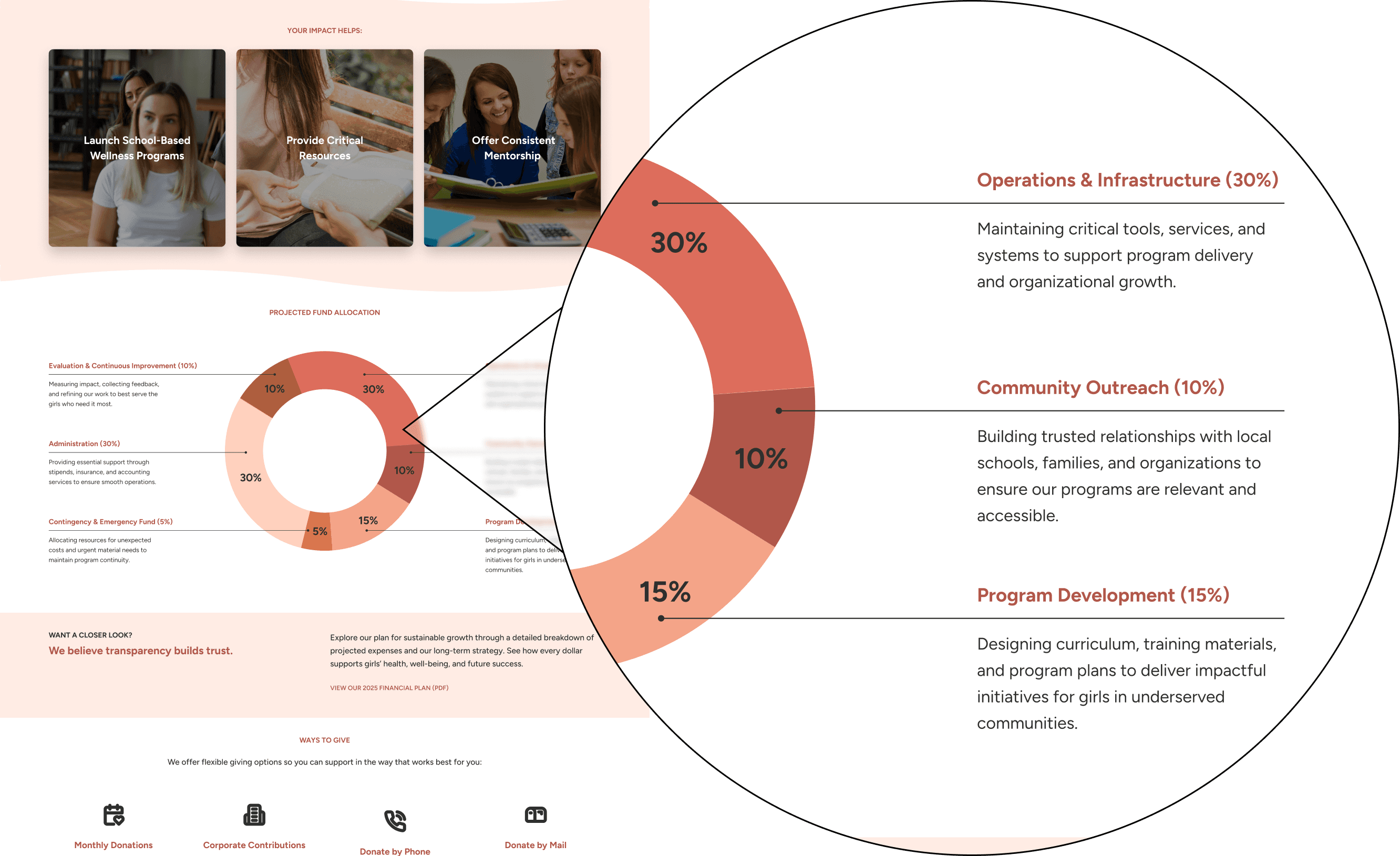
Early feedback revealed that users struggled to trust the site due to vague language and missing details. This led to a content-focused redesign that prioritized transparency and clarity: refining the foundation’s mission statement, detailing upcoming pilot programs, and tailoring the 'Your Impact Helps' section to clearly show how user involvement supports the community.
Clearer language and additions like program information links helped the site feel credible and community-driven from the start.
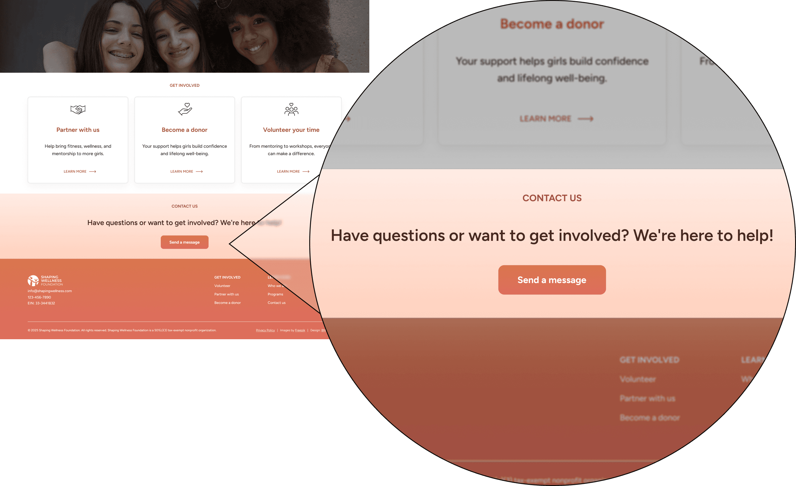
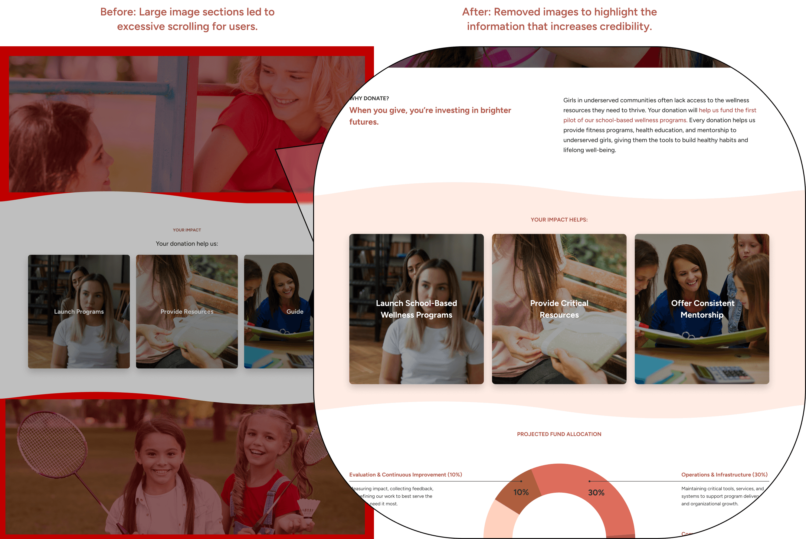
PRIORITY REVISION 2: REDUCING SCROLL FATIGUE
While I initially assumed that visuals, simplicity, and white space would create an inviting and user-friendly experience, user testing revealed the opposite. Observations showed that every user had to scroll more than eight times to reach the bottom of some pages and many didn’t make it before clicking away. This insight prompted a redesign: I removed non-essential images that added visual clutter and length without value.
After the update, users consistently reached the bottom of the page, improving both engagement and usability.
FINAL PROTOTYPE
COLLABORATING WITH DEVELOPMENT
REFLECTION & NEXT STEPS
A LEARNING PROCESS
This project was an amazing opportunity to practice end-to-end UX and UI design, from discovery and brand creation to interface design and development. As the only designer, I wore many hats and learned to balance stakeholder needs, user behavior, and content strategy all within one cohesive product.
A huge thank you to Jay Cho, the talented developer I’ve had the pleasure of working alongside. His collaboration, feedback, and problem-solving made it possible to bring this vision to life. Building something meaningful for a foundation so close to our home base has been an incredibly rewarding experience.
LAUNCHING & EXPANSION
After launch, I’ll shift my focus to testing with real users on the live site to better understand its impact and identify areas for improvement. With data-driven insights in hand, we’ll continue iterating on the experience. Looking ahead, we plan to expand the site with new pages designed to build trust and amplify our mission, including:
A newsletter and blog
An events and marketing hub
A dedicated section for financial transparency and impact reporting
Thank you for reading!