Project overview
Project overview
A new approach to medication management
Remi is a mobile-first website that helps users easily manage treatments, medications, and health-related routines digitally. Remi offers features such as medication scanning, medication tracking, and interaction warnings to encourage adherence to medication schedules and decrease total missed doses.
Unpacking the problem
Medication nonadherence decreases the benefits of pharmacological therapy and is a significant issue worldwide.
Many people struggle to keep up with their medication and stay on track with treatment, contributing to an increase in medication nonadherence which affects patients, providers, and the healthcare system as a whole.


Transforming medication management into a habit
Goal 1: Improve the medication management experience
Create an enjoyable digital experience so that users feel encouraged to stay consistent with their medication intake and reduce medication nonadherence rates.
Goal 2: Increase medication adherence rates
Encourage daily use of products through an user-friendly interface and convenient features so that users can consistently stay on schedule.
Future projected goal: ensuring data security and privacy
Ensure user data is encrypted and protected using high standards of data privacy and security so that data breaches are minimized and users feel comfortable trusting Remi with health information.

Defining the problem
What will make Remi different?
Current solutions for medication management offer mobile applications with subscription services or limited free version features. These products are offered for most mobile devices, with some limiting use to devices running on IOS.
None of the current solutions offer website access, limiting medication management to a single mobile device running specific operating systems.

Understanding my users
Research goals
To understand what features would encourage users to adhere to treatments and medication regimens, we needed to learn about how patients are currently managing medications, how medication management fits into daily (work) life, and understand the process of managing multiple medications at a time.
What factors contribute to medication nonadherence the most?
Unique challenge
A challenge for this stage with this topic was ensuring interviews were carefully planned to ensure research was carried out safely and ethically, since it involved having participants share sensitive information regarding their health. Leveraging my background as an EMT, I was able to create a welcoming environment for participants and ensured they could skip over any question they weren’t comfortable answering and/or omit any information shared at any point of the process.


What keeps people from taking their meds?
I conducted interviews with 9 people in different career stages, age ranges, genders, and ethnicities and within at least one of the following categories:
• People who have taken or are currently taking at least 3 medications.
• People who recently followed a health-related routine (treatment plan with/without medications).
• People who currently manage medications for themselves.
• People who have chronic illnesses that require medication management

Insights behind the design
Forgetfulness is a common struggle
People struggle with remembering to take their medication and recalling information despite using visual cues, digital reminders, organization, and routines to try to stay consistent during their busy schedules.
Importance depends on impact on daily activities
People often see supplements as less critical than essential medications if they don’t see immediate effects after taking them or missing a dose, leading to a more relaxed attitude toward missed doses. People who were more consistent mentioned they do so to avoid negatively impacting their daily activities.
Lack of knowledge is overwhelming and causes confusion
A common frustration came from difficulty in differentiating medications when their prescription changes. Some people look for information from official sources and labels, while others rely on their healthcare providers for information to avoid confusion and being overwhelmed.
Technology needs to be easy to use and convenient
Main problems with technology were limited knowledge, too difficult to learn, not easy to work with, and concerns about privacy. People are open to using technology to help manage their health if they can learn to use it easily.

Our users
Bringing two users to life
I was surprised to find from research that the nonadherence rate is the highest (58.1%) in young adults aged 18-35.
User interviews influenced the creation of empathy maps for two personas to design for: the infrequent supplement user and the essential medication user. By analyzing the experiences, pain points, and needs of my user group, I identified the two key user types who would benefit from Remi.


Early ideation
Mapping out the experience
Listening to user needs, I chose the add new medication flow to be the main feature of Remi. Users can initially choose to record a single dose or add a new prescription medication. Users have the option of choosing how they want to add the medication: manually or scanned.

Early ideation
Using user interviews, I chose 3 key features based on user needs for the MVP for testing: medication scanning, interaction warnings, and medication tracking. With these in mind, I created a site map and separated which screens to focus on for this project to best fit the needs of my user group.

Design
Prioritizing function and organization
Content was the main focus for the early sketches of Remi. Making sure all the information needed was included in the sketches allowed me to prioritize function and focus on organization between screens and sections.

Low fidelity wireframes
When digitizing the sketches, the primary goals were to design the priority features as simple as possible while also including the information that users need the most. The frames below were the first iteration of the screens users would be accessing the most.

Visual design
Building the brand
I wanted Remi to be simple, reliable, calming, and innovative. For the brand design, I chose cool colors to match this brand tone. Since this product is meant to help users with taking care of their health, I chose the word “Remi” as the name. The word is of French origin, meaning cure or remedy.
For the logo, I chose a symbol of healing and comfort: the hummingbird, which aligns with the overall goal of Remi.
To add to a minimal and familiar experience, I opted for a modern, sans-serif typeface for Remi. Nunito is a rounded font that is readable, inviting, and simple. Similarly, for iconography, I used material symbols icons along with 6 custom icons made specifically for this project. The icons are outlined with round strokes for a softer look.

UI component library
Since there were various elements that would be reused throughout all the different screens, I decided to create a component library for Remi. The components included text fields, tab labels, dropdown styles, and medication cards styles among other recurring elements.

High fidelity wireframes
Removing unnecessary elements
Using task flows and user flows, I narrowed down key screens to focus on for the higher fidelities. I combined some screens to shorten the flow and eliminate any unnecessary screens. When creating the higher fidelity designs, I decided to reduce information shown on certain screens and reorganize information to reduce information overload for users, as getting overwhelmed with too much information was a key issue brought up during user interviews.


Refining the experience
The dashboard had the most visual iterations before testing, specifically in colors, shadows, and outlines.
I wanted cards to be distinguishable between active and inactive states and not stray too much from the color palette. I kept iterating after receiving feedback, keeping WCAG and accessibility in mind when deciding between colors.
The first iteration had muted color combinations which did not align with Remi’s branding.

Prototyping
Using Figma's advanced features
The focus of this phase of the project was using variant properties and Boolean variables. I was able to use variable modes to alter visibility states of various components at a time with just one click.
Using variables, collections, and modes, I was able to make some elements appear when the user wants to see them and collapse when they don’t. This would help lessen information overload for the users that get easily overwhelmed.
To test the functionality of Remi, I used prototyping to create overlays, make elements appear and disappear after specific interactions, and make scroll wheels and lists interactive. My goal was to make the experience as close to a functioning mobile-first website as I could.

Making interactions feel seamless
The set frequency screen is a single screen designed using prototyping features in Figma. Using variables and variable modes, elements and sections are hidden and only shown when the user selects a certain option. The addition of this improved the usability testing experience and allowed me to receive better results when testing the product.
Usability testing
Testing the prototype
To test the usability of Remi, we tested three main task flows:
Scan to add a medication
A priority feature for ‘infrequent supplement user’ persona, reduces workflow and streamlines medication input process.
Reschedule dose
A part of the MVP along with “take dose” and “skip dose” that allows users to efficiently adjust reminders as needed.
Access medication information
A priority feature for the ‘essential medication user’ persona that encourages consistency by providing accessible medication information.
The test helped gauge the effectiveness and usability of Remi and identify any issues and areas of improvement to increase the usability of the product. In order to quantify this data, at the end of the test, participants were asked to complete a system usability questionnaire. The responses were converted to a System Usability Score (SUS).


Priority revisions
Screen redesign
Usability testing prompted a redesign of the medication information screen, with reorganization of the tabs to show warnings first.
The medication schedule was added to this screen with an edit icon next to it instead of on top to reduce confusion and ensure users know that they can edit the schedule and not the information.
Interaction labels were updated to include drug interaction classification information. this informs users of the severity of the interaction, which was the main point of confusion in the medication information flow.

Confirmation pop-up removal
Most of the users navigated to the medication information screen after completing a flow, which was unexpected. The intention of the end of flow pop-up was to give users access to new medication information, but it instead caused extra confusion. To eliminate this confusion, the end of flow confirmation screen was eliminated from all the flows and instead replaced with an “action done” notification which disappears after a delay. This change reduces confusion and increases the efficiency of all flows.

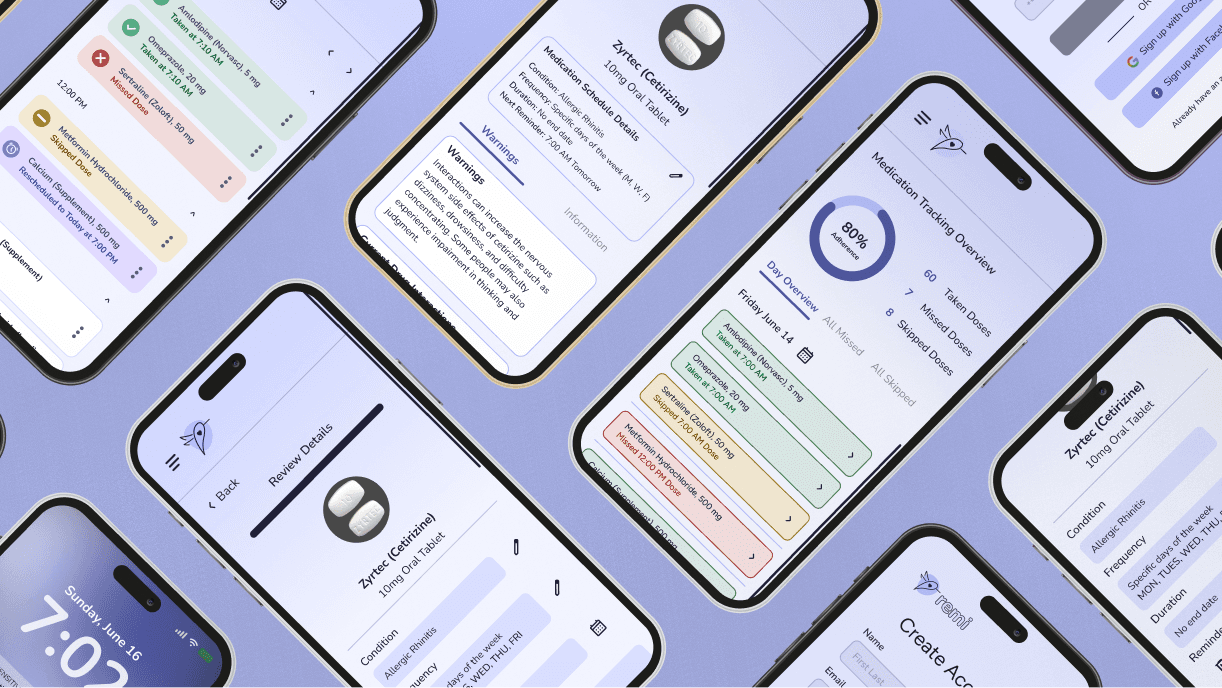
Final Designs
Account creation
A goal for Remi was to help privacy-conscious individuals feel secure using medication management websites because concerns about data usage and safety prevent them from adopting new technology for healthcare. This brought the design of the account creation screen prompting users to verify their account, making sure their data is secure.

Mobile-push notifications
I wanted to provide features such as reminders to improve and encourage adherence to medication schedules because remembering to take medications and recalling medication information were common challenges brought up during user interviews. A mobile-push notification along with a dose alert allows users to quickly skip or reschedule a medication to be reminded again without disrupting their busy schedule.

Left-sided navigation
Remi features a left-sided navigation to provide users with a familiar and intuitive experience mobile experience. This menu keeps frequently used features easily accessible, reducing the number of clicks required to navigate through Remi. This menu also adapts well to different screen sizes, enhancing usability and allowing users to access Remi across a wide range of devices.

Scanning feature
To make Remi a convenient and efficient experience for users, I included a scanning feature that offers pill and prescription identification. This streamlines the process of adding medications, distinguishing pills, and setting preset alarms for each medication.

Add a medication
Users can manually add medications to create a schedule tailored to their specific needs. They can choose from a variety of options to customize reminders, helping encourage consistent adherence to their regimen.

Final prototype
Next steps
Product enhancement
Remi would benefit from another round of usability testing to evaluate the impact of recent changes compared to the first test. The goal is to reduce time on task and increase medication adherence rates. This would involve launching the product and measuring success over a set period of time.
Adding features such as condition information, refill reminders, and expiration alerts would make Remi a more comprehensive solution. Incorporating adherence reports, multi-user support, and health data integration would further enhance Remi, and make it into a well-rounded health management application.
Limitation: medication database source
A challenge when developing a medication management product is choosing an accurate, reliable, up-to-date medication database. Remi was created with the assumption that the database must include drug names, dosages, side effects, interactions, and usage instructions for prescription and over-the-counter medications.
Reflection
My favorite part of designing Remi was prototyping and seeing my designs come to life. While it was challenging, I thoroughly enjoyed the process of learning and was surprised to see how much problem-solving and iterating is involved in the prototyping process.
I really enjoyed designing for this topic because it’s something I am deeply passionate about. Drawing from my experience as an emergency medical technician and caregiver, I encountered this problem daily, seeing its significant impact on patient health. In the future, I hope to collaborate with a developer to launch Remi as a fully developed product, aiming to share it with others and make a significant impact.
Thank you for reading!
Project overview
A new approach to medication management
Remi is a mobile-first website that helps users easily manage treatments, medications, and health-related routines digitally. Remi offers features such as medication scanning, medication tracking, and interaction warnings to encourage adherence to medication schedules and decrease total missed doses.
Unpacking the problem
Medication nonadherence decreases the benefits of pharmacological therapy and is a significant issue worldwide.
Many people struggle to keep up with their medication and stay on track with treatment, contributing to an increase in medication nonadherence which affects patients, providers, and the healthcare system as a whole.

Transforming medication management into a habit
Goal 1: Improve the medication management experience
Create an enjoyable digital experience so that users feel encouraged to stay consistent with their medication intake and reduce medication nonadherence rates.
Goal 2: Increase medication adherence rates
Encourage daily use of products through an user-friendly interface and convenient features so that users can consistently stay on schedule.
Future projected goal: ensuring data security and privacy
Ensure user data is encrypted and protected using high standards of data privacy and security so that data breaches are minimized and users feel comfortable trusting Remi with health information.
Defining the problem
What will make Remi different?
Current solutions for medication management offer mobile applications with subscription services or limited free version features. These products are offered for most mobile devices, with some limiting use to devices running on IOS.
None of the current solutions offer website access, limiting medication management to a single mobile device running specific operating systems.
Understanding my users
Research goals
To understand what features would encourage users to adhere to treatments and medication regimens, we needed to learn about how patients are currently managing medications, how medication management fits into daily (work) life, and understand the process of managing multiple medications at a time.
What factors contribute to medication nonadherence the most?
Unique challenge
A challenge for this stage with this topic was ensuring interviews were carefully planned to ensure research was carried out safely and ethically, since it involved having participants share sensitive information regarding their health. Leveraging my background as an EMT, I was able to create a welcoming environment for participants and ensured they could skip over any question they weren’t comfortable answering and/or omit any information shared at any point of the process.

What keeps people from taking their meds?
I conducted interviews with 9 people in different career stages, age ranges, genders, and ethnicities and within at least one of the following categories:
• People who have taken or are currently taking at least 3 medications.
• People who recently followed a health-related routine (treatment plan with/without medications).
• People who currently manage medications for themselves.
• People who have chronic illnesses that require medication management
Insights behind the design
Forgetfulness is a common struggle
People struggle with remembering to take their medication and recalling information despite using visual cues, digital reminders, organization, and routines to try to stay consistent during their busy schedules.
Importance depends on impact on daily activities
People often see supplements as less critical than essential medications if they don’t see immediate effects after taking them or missing a dose, leading to a more relaxed attitude toward missed doses. People who were more consistent mentioned they do so to avoid negatively impacting their daily activities.
Lack of knowledge is overwhelming and causes confusion
A common frustration came from difficulty in differentiating medications when their prescription changes. Some people look for information from official sources and labels, while others rely on their healthcare providers for information to avoid confusion and being overwhelmed.
Technology needs to be easy to use and convenient
Main problems with technology were limited knowledge, too difficult to learn, not easy to work with, and concerns about privacy. People are open to using technology to help manage their health if they can learn to use it easily.
Our users
Bringing two users to life
I was surprised to find from research that the nonadherence rate is the highest (58.1%) in young adults aged 18-35.
User interviews influenced the creation of empathy maps for two personas to design for: the infrequent supplement user and the essential medication user. By analyzing the experiences, pain points, and needs of my user group, I identified the two key user types who would benefit from Remi.
Early ideation
Mapping out the experience
Listening to user needs, I chose the add new medication flow to be the main feature of Remi. Users can initially choose to record a single dose or add a new prescription medication. Users have the option of choosing how they want to add the medication: manually or scanned.
Early ideation
Using user interviews, I chose 3 key features based on user needs for the MVP for testing: medication scanning, interaction warnings, and medication tracking. With these in mind, I created a site map and separated which screens to focus on for this project to best fit the needs of my user group.
Design
Prioritizing function and organization
Content was the main focus for the early sketches of Remi. Making sure all the information needed was included in the sketches allowed me to prioritize function and focus on organization between screens and sections.
Low fidelity wireframes
When digitizing the sketches, the primary goals were to design the priority features as simple as possible while also including the information that users need the most. The frames below were the first iteration of the screens users would be accessing the most.
Visual design
Building the brand
I wanted Remi to be simple, reliable, calming, and innovative. For the brand design, I chose cool colors to match this brand tone. Since this product is meant to help users with taking care of their health, I chose the word “Remi” as the name. The word is of French origin, meaning cure or remedy.
For the logo, I chose a symbol of healing and comfort: the hummingbird, which aligns with the overall goal of Remi.
To add to a minimal and familiar experience, I opted for a modern, sans-serif typeface for Remi. Nunito is a rounded font that is readable, inviting, and simple. Similarly, for iconography, I used material symbols icons along with 6 custom icons made specifically for this project. The icons are outlined with round strokes for a softer look.
UI component library
Since there were various elements that would be reused throughout all the different screens, I decided to create a component library for Remi. The components included text fields, tab labels, dropdown styles, and medication cards styles among other recurring elements.
High fidelity wireframes
Removing unnecessary elements
Using task flows and user flows, I narrowed down key screens to focus on for the higher fidelities. I combined some screens to shorten the flow and eliminate any unnecessary screens. When creating the higher fidelity designs, I decided to reduce information shown on certain screens and reorganize information to reduce information overload for users, as getting overwhelmed with too much information was a key issue brought up during user interviews.
Refining the experience
The dashboard had the most visual iterations before testing, specifically in colors, shadows, and outlines.
I wanted cards to be distinguishable between active and inactive states and not stray too much from the color palette. I kept iterating after receiving feedback, keeping WCAG and accessibility in mind when deciding between colors.
The first iteration had muted color combinations which did not align with Remi’s branding.
Prototyping
Using Figma's advanced features
The focus of this phase of the project was using variant properties and Boolean variables. I was able to use variable modes to alter visibility states of various components at a time with just one click.
Using variables, collections, and modes, I was able to make some elements appear when the user wants to see them and collapse when they don’t. This would help lessen information overload for the users that get easily overwhelmed.
To test the functionality of Remi, I used prototyping to create overlays, make elements appear and disappear after specific interactions, and make scroll wheels and lists interactive. My goal was to make the experience as close to a functioning mobile-first website as I could.
Making interactions feel seamless
The set frequency screen is a single screen designed using prototyping features in Figma. Using variables and variable modes, elements and sections are hidden and only shown when the user selects a certain option. The addition of this improved the usability testing experience and allowed me to receive better results when testing the product.
Usability testing
Testing the prototype
To test the usability of Remi, we tested three main task flows:
Scan to add a medication
A priority feature for ‘infrequent supplement user’ persona, reduces workflow and streamlines medication input process.
Reschedule dose
A part of the MVP along with “take dose” and “skip dose” that allows users to efficiently adjust reminders as needed.
Access medication information
A priority feature for the ‘essential medication user’ persona that encourages consistency by providing accessible medication information.
The test helped gauge the effectiveness and usability of Remi and identify any issues and areas of improvement to increase the usability of the product. In order to quantify this data, at the end of the test, participants were asked to complete a system usability questionnaire. The responses were converted to a System Usability Score (SUS).

Priority revisions
Screen redesign
Usability testing prompted a redesign of the medication information screen, with reorganization of the tabs to show warnings first.
The medication schedule was added to this screen with an edit icon next to it instead of on top to reduce confusion and ensure users know that they can edit the schedule and not the information.
Interaction labels were updated to include drug interaction classification information. this informs users of the severity of the interaction, which was the main point of confusion in the medication information flow.
Confirmation pop-up removal
Most of the users navigated to the medication information screen after completing a flow, which was unexpected. The intention of the end of flow pop-up was to give users access to new medication information, but it instead caused extra confusion. To eliminate this confusion, the end of flow confirmation screen was eliminated from all the flows and instead replaced with an “action done” notification which disappears after a delay. This change reduces confusion and increases the efficiency of all flows.
Final Designs
Account creation
A goal for Remi was to help privacy-conscious individuals feel secure using medication management websites because concerns about data usage and safety prevent them from adopting new technology for healthcare. This brought the design of the account creation screen prompting users to verify their account, making sure their data is secure.
Mobile-push notifications
I wanted to provide features such as reminders to improve and encourage adherence to medication schedules because remembering to take medications and recalling medication information were common challenges brought up during user interviews. A mobile-push notification along with a dose alert allows users to quickly skip or reschedule a medication to be reminded again without disrupting their busy schedule.
Left-sided navigation
Remi features a left-sided navigation to provide users with a familiar and intuitive experience mobile experience. This menu keeps frequently used features easily accessible, reducing the number of clicks required to navigate through Remi. This menu also adapts well to different screen sizes, enhancing usability and allowing users to access Remi across a wide range of devices.
Scanning feature
To make Remi a convenient and efficient experience for users, I included a scanning feature that offers pill and prescription identification. This streamlines the process of adding medications, distinguishing pills, and setting preset alarms for each medication.
Add a medication
Users can manually add medications to create a schedule tailored to their specific needs. They can choose from a variety of options to customize reminders, helping encourage consistent adherence to their regimen.
Final prototype
Next steps
Product enhancement
Remi would benefit from another round of usability testing to evaluate the impact of recent changes compared to the first test. The goal is to reduce time on task and increase medication adherence rates. This would involve launching the product and measuring success over a set period of time.
Adding features such as condition information, refill reminders, and expiration alerts would make Remi a more comprehensive solution. Incorporating adherence reports, multi-user support, and health data integration would further enhance Remi, and make it into a well-rounded health management application.
Limitation: medication database source
A challenge when developing a medication management product is choosing an accurate, reliable, up-to-date medication database. Remi was created with the assumption that the database must include drug names, dosages, side effects, interactions, and usage instructions for prescription and over-the-counter medications.
Reflection
My favorite part of designing Remi was prototyping and seeing my designs come to life. While it was challenging, I thoroughly enjoyed the process of learning and was surprised to see how much problem-solving and iterating is involved in the prototyping process.
I really enjoyed designing for this topic because it’s something I am deeply passionate about. Drawing from my experience as an emergency medical technician and caregiver, I encountered this problem daily, seeing its significant impact on patient health. In the future, I hope to collaborate with a developer to launch Remi as a fully developed product, aiming to share it with others and make a significant impact.
Thank you for reading!